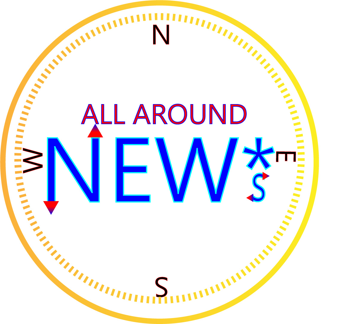
For this project I decided to create a logo that would represent my new media company called All Around NEW*s. The company aims to promote new media platforms through the internet such as podcasting, blogging, and streaming. I made a compass as a play on words of the “All Around” part of the title. The ‘*s’ is supposed to represent that this is a new media company and not just the classic form of news.
For my research I looked at other broadcasting companies such as CNN, FOX, and NBC. All of these companies have very simple logos with large text and little graphical design. This is because there logo is almost always displayed on a small scale on television so it has to be easily readable and identifiable. I tried to make my logo a very large text and the outline can be easily seen as a compass. The ‘all around’ text may be too small to see if scaled down but could ultimately be removed due to the compass outline anyway.
For my design process I started off with the NEW*s text and then found fill and stroke that I liked. I tried to use a gradient for the text but you can’t use gradient in a stroke. Then I made the ‘all around’ text and found a good fill and stroke. Then I made two concentric circles around the text and used a yellow to gold gradient, trying to emulate a gold compass. Then I put in the north, south, east, and west letters and rotated them as they would appear on a real compass. When it was all done I adjusted locations and scaling so that it looked appealing to the eye.
For all the elements in my logo I used only illustrator tools. Such tools included, ellipse tool, polygon tool, text tool, rotation tool, gradient, and made swatches to try and find the right colors. In the beginning I had some problems with grouping and making sure that the colors were coordinated and looked good. Overall though the process went fairly smooth.

Hey Eric, I think you have a great start going for you. I like the tag line “all around news” and compass concept is unique. Going along with the compass concept, I think you could go with that further and make it look more like a compass with the ticks and stuff. Maybe look a sketch of compasses to get an idea? Then, to make it not drown out the text, decrease the opacity. I was a little confused about the “*s”. I figured it out by reading about it below. It is an interesting touch, but I think you can do without it. Also, there are a lot of colors going on and a lot of the them contrasting which makes it distract and draws away from your tagline. Try and pick two, no more than three colors. I think keeping the “all around news” one color could maybe help. Overall, you are headed in the right direction.
LikeLike
Hi Eric,
I think you have a very strong rough draft for your logo, it was a creative idea to use a compass as a play on words for your “All Around News”. I think the gradient on the compass and arrows on the letters looks really cool. A suggestion I have for your design is to add a fill color to the compass so there is less blank space, you might have to change up the colors a little bit for the letters and compass outline but I don’t think that would change the quality of it unless you are really set on the colors you have. Another suggestion I have is to try a bolder font so that they really stand out with the fill and if the logo is shrunken down for a shirt or something. Overall, I think you have a very strong and creative logo that doesn’t need much change.
LikeLike
Hey Eric! I really like how your logo turned out! I like how you used the border from one of the tutorials we watched. I also like how you put the arrows on the N and the S. Some advice I could give would be to move the S at the bottom up a little so it’s not touching the border. Also, maybe make the borders a little bit thicker, I can see that you used the gradient tool and it looks really cool but it took me a while to notice that because they are really thin. Other than that, I think it looks really good!
LikeLike
you did a really good job with the creating a very unique twist on the illustrator tutorials already given to us. i really like the colors that you used as well. the shaping is a bit off but so was mine! i also like the unique message that place off with you over all theme of your word press blog! it ties in very well with your theme of baseball and sports and i think its really cool. Good job.
LikeLike
i totally thought i was looking at a different, didnt mean to say baseball lol sorry!
LikeLike