- What was your favorite project(s) during the semester? Please explain why: My favorite project this semester was the audio story. This is because I have always enjoyed writing scripts and performing them. When I was young I would write my own youtube videos which were mostly monologues of me talking about video games and sports. I am also in COM 300 right now and we do a lot of broadcast writing which is practically synonymous with the audition assignment. It was also fun to learn a new adobe software because I am familiar with premier pro and photoshop as well.
- What skills did you learn in the course that you believe you will use in the future? : I believe that I will use photoshop in the future because I usually like to make funny edits of my friends and other pop-culture references. Photoshop is also useful for recreating logos and other advertisements for a company. I also think that creating a timeline for what you want to do with your company and interests is a good skill that I learned from this course.
- What coursework or career path do you see in your future? What skills or projects from this class may be influential in your chosen career path? : I see myself as a journalist in the future. The skill of writing a story and storyboard is important to the success of myself as a journalist. Journalists need to know what they are writing about and how to organize information so that it is understandable for the reader. Another skill that may help my career path is writing these blog posts as they are a long form explanation of what we did in class.
- Is there any skill that you wished you would have learned in this course that you did not learn? If yes, what skill is that? : I wish I would have learned more about the microsoft suite such as excel and powerpoint. While the adobe suite has many useful pieces of software the microsoft suite seems to be used more in an office setting. Knowing both of these would be beneficial rather than just using one of them. I.E. do excel and power point then photoshop and premier.
- Did you find any websites or resources from outside the class material that were especially useful? : If I ever had a problem with the software YouTube was my go to site for figuring it out. Many of the YouTube tutorials were very helpful and easy to understand. The tutorials for the class were good but the YouTube tutorials were much more in depth and focused on more than just bare bones editing and such. I also used the adobe website sometimes as they have employees who monitor the forums for any troubleshooting or questions.
- If you have any other thoughts, comments, suggestions, etc., please feel free to add them to your post : I felt that most of this class was useful but there were definitely some assignments that felt like busy work. I am specifically talking about the “raw footage” and “sketch” assignments. I felt that these really had no value to the assignment and were purely made just for having an assignment. Most of the time the draft would look completely different than the raw footage. This makes those menial assignments obsolete and I would urge to rethink a different assignment. Other than that this class was a pleasure.
Author Archives: ericvirta
FINAL DRAFT
IDEA AND INSPIRATION
I decided to create a mock newscast and advertisement for my project. This style works for my topic as my topic is a future company that I would like to pursuit later in life. Having a good and funny advertisement is very crucial in today’s media climate. Also the mock newscast works because my company focuses on the future of news and strays away from the traditional news platform. Mocking this type of news gives my company more credit in the long run
DESIGN PROCESS
Some design principles that I used were the use of transition cards. I have always thought that transition cards can be used in a meaningful and funny way. One of the prime examples of this is the way spongebob square-pants uses transition title cards for humor. Transition cards also show changes in time and ideas which is important. I researched how to make good title cards and found that they have to be simple and easy to read in order to be effective. If there is too much going on on a title card then it can become confusing and there is not as much of an impact on the audience. I also used black and white to show that the old way of news was bland and old. I loved the movie the Artist and other silent movies in black and white and they show that there is darkness, loss of time, dullness, and many other things that black and white can symbolize. My design process started with my recording the two main video clips and writing scripts for both of them. I am in COM 300 so I know that I need a decent amount of writing for a 30 second clip so I wrote a little more than I needed for both. I then created the title cards and made sure they looked good and were funny. Then lastly I added transitions and the black and white effect to the first clip. After receiving some suggestions I decided to put a title screen at the beginning of my video. This hopefully will clear up confusion for what my video is about and make it not just jump straight into the action without any foreword.
TECHNICAL DETAILS
I created all of the elements in my project besides the dubstep song used for my logo screen. I started by collecting all the raw details before I began even using premier. Once I had all the materials, I started from the beginning of my storyboard and went frame by frame through it. The techniques I used were cropping, video effects, video transitions, text tool, title tool, audio distortion to turn the gain down, and many other basic features of the software. I had some challenges when it came to making sure the transitions were good and lined up right. I went back and forth on whether deciding to use a straight cut or a fade or other transition as well. As for the software I had no real troubles at all besides the exporting. For my draft it was very easy to export but when I opened up the file again to change stuff around I could not for the life of me export. It took me about 45 minutes to finally figure out I needed the source files in the project in order to export. Tips I would give is to make sure that you have all your materials organized and the story lined up. Premier can be a very difficult software if you don’t know what you want to do with the software.
Royalty free music I used:
https://www.bensound.com/royalty-free-music/track/dubstep
Video Draft
IDEA AND INSPIRATION
I decided to create a mock newscast and advertisement for my project. This style works for my topic as my topic is a future company that I would like to pursuit later in life. Having a good and funny advertisement is very crucial in today’s media climate. Also the mock newscast works because my company focuses on the future of news and strays away from the traditional news platform. Mocking this type of news gives my company more credit in the long run
DESIGN PROCESS
Some design principles that I used were the use of transition cards. I have always thought that transition cards can be used in a meaningful and funny way. One of the prime examples of this is the way spongebob square-pants uses transition title cards for humor. Transition cards also show changes in time and ideas which is important. I researched how to make good title cards and found that they have to be simple and easy to read in order to be effective. If there is too much going on on a title card then it can become confusing and there is not as much of an impact on the audience. I also used black and white to show that the old way of news was bland and old. I loved the movie the Artist and other silent movies in black and white and they show that there is darkness, loss of time, dullness, and many other things that black and white can symbolize. My design process started with my recording the two main video clips and writing scripts for both of them. I am in COM 300 so I know that I need a decent amount of writing for a 30 second clip so I wrote a little more than I needed for both. I then created the title cards and made sure they looked good and were funny. Then lastly I added transitions and the black and white effect to the first clip.
TECHNICAL DETAILS
I created all of the elements in my project besides the dubstep song used for my logo screen. I started by collecting all the raw details before I began even using premier. Once I had all the materials, I started from the beginning of my storyboard and went frame by frame through it. The techniques I used were cropping, video effects, video transitions, text tool, title tool, audio distortion to turn the gain down, and many other basic features of the software. I had some challenges when it came to making sure the transitions were good and lined up right. I went back and forth on whether deciding to use a straight cut or a fade or other transition as well. As for the software I had no real troubles at all. Some tips I would give is to make sure that you have all your materials organized and the story lined up. Premier can be a very difficult software if you don’t know what you want to do with the software.
Royalty free music I used:
https://www.bensound.com/royalty-free-music/track/dubstep
STORYBOARD/ROUGH CLIPS

Adobe Audition Final Draft
Design Process
For this project I decided to create a narrative piece detailing why I think my media company, All Around New*s, could be successful. I begin talking about how newspapers and radio played an important part in people’s lives early in the 20th century. I then begin to talk about how smartphones changed the everyday lives of people as the internet became an open forum and everyone that has a smart phone has an opportunity to contribute to the conversation. I think this is a good way to explain why my company will be successful because it shows the changes that have occurred within the media space. Also if a company does not adapt to the trends such as internet and smartphones they will not survive long. I researched statistics on smart phone usage around the world and when the iPhone was invented to show how fast the technology has changed in only a matter of years. The audio in the background of the first segment represents old time jazz for ambiance as i picture in almost a noir film. The other music is more modern but still gives the feel of almost a news room or some sort of media production.
Technical Detail
I collected my background music from two royalty free sites (see sources and materials) and sorted through the sites to find the songs I thought would fit my story the best. I recorded my raw audio through my laptop’s recording software and then converted the .mp4a files to .mp3 files. When I started listening to my audio there was some space at the beginning and end of the clips. I cropped these so that there was as little dead air as possible during the beginning and end. I also turned the volume down on the music tracks and placed them both on track two line so that they would not change pitch during the switch between music. I honestly had little to no problems with compiling these audio files. I find audition to be a very simple and well thought out program. One tip I would have is to make sure that your raw audio does not have too much background noise (fans, air conditioning, ect.) as it can make the tracks harder to sound good.
Sources and Materials
https://www.bensound.com/royalty-free-music?download=thelounge
https://incompetech.com/music/royalty-free/index.html?isrc=usuan1600033
Facts for script:
https://www.statista.com/statistics/330695/number-of-smartphone-users-worldwide/
iPhone History: Every Generation in Timeline Order 2007 – 2023
FINAL DRAFT LOGO

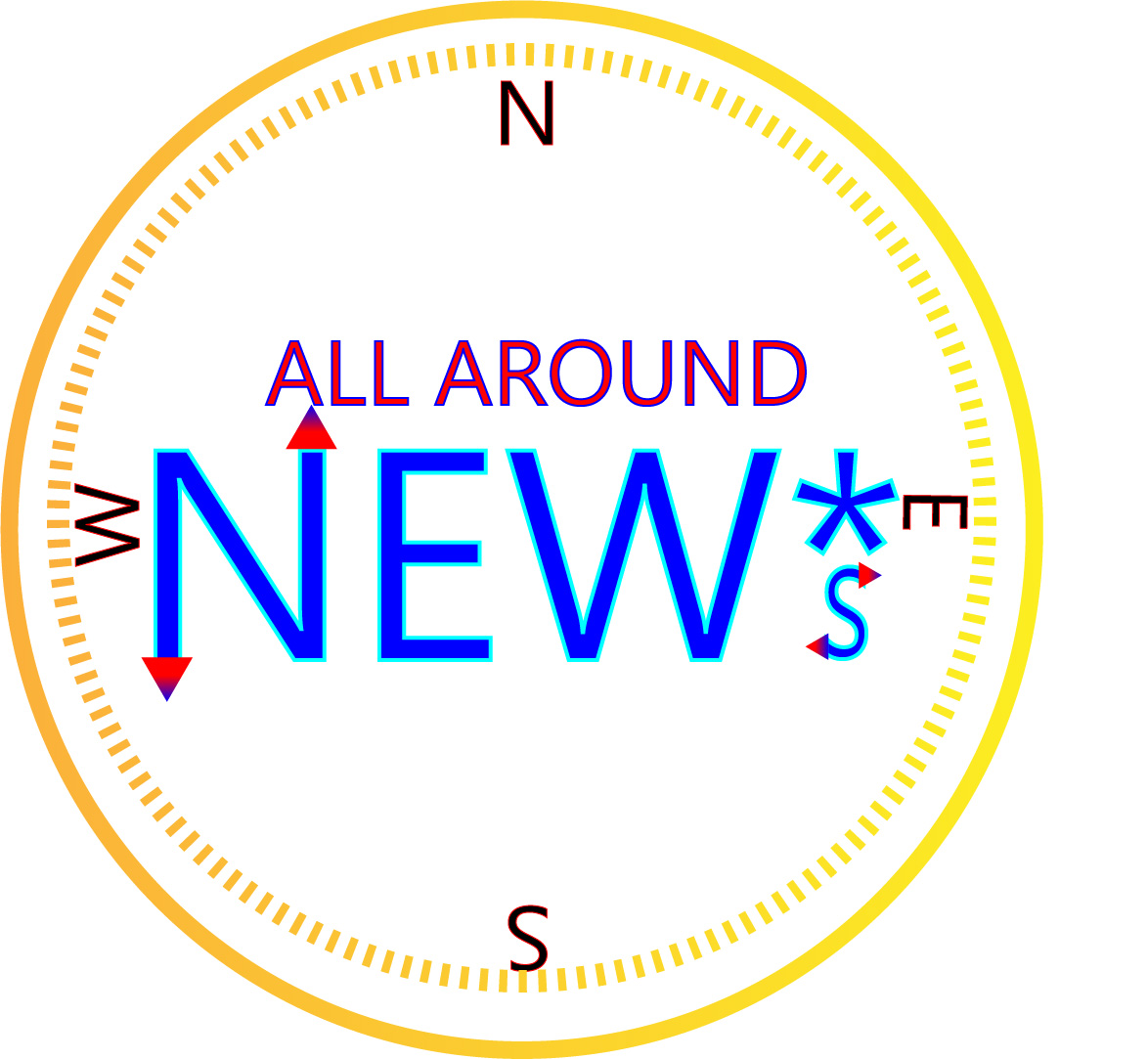
For this project I decided to create a logo that would represent my new media company called All Around NEW*s. The company aims to promote new media platforms through the internet such as podcasting, blogging, and streaming. I made a compass as a play on words of the “All Around” part of the title. The ‘*s’ is supposed to represent that this is a new media company and not just the classic form of news.
For my research I looked at other broadcasting companies such as CNN, FOX, and NBC. All of these companies have very simple logos with large text and little graphical design. This is because there logo is almost always displayed on a small scale on television so it has to be easily readable and identifiable. I tried to make my logo a very large text and the outline can be easily seen as a compass. The ‘all around’ text may be too small to see if scaled down but could ultimately be removed due to the compass outline anyway. In my final draft I changed my font to be in black and white as to not distract from my message with a myriad of colors and gradients.
For my design process I started off with the NEW*s text and then found fill and stroke that I liked. I tried to use a gradient for the text but you can’t use gradient in a stroke. Then I made the ‘all around’ text and found a good fill and stroke. Then I made two concentric circles around the text and used a yellow to gold gradient, trying to emulate a gold compass. Then I put in the north, south, east, and west letters and rotated them as they would appear on a real compass. The compass star was added to give a sense that it was a real compass as well as to fill empty space in the circle.
The feedback that I took to heart was changing colors, empty space, and fonts. I changed the background color to an orange-yellow so that the letters would pop more off the logo. For filling empty space I changed my spacing of the letters and North, South, East, and West letters. I also added a compass star to emphasize the compass aspect of my logo. For my fonts I changed a couple of them to look more clear. I also changed the size of the asterisk and S so that the S was more prominent and the asterisk was smaller.
For all the elements in my logo I used only illustrator tools. Such tools included, ellipse tool, polygon tool, text tool, rotation tool, gradient, and made swatches to try and find the right colors. In the beginning I had some problems with grouping and making sure that the colors were coordinated and looked good. Overall though the process went fairly smooth. I am very happy with how the final design turned out and I hope to use it for my company in the future!
Star source: https://svgsilh.com/image/311277.html
LOGO DRAFT
For this project I decided to create a logo that would represent my new media company called All Around NEW*s. The company aims to promote new media platforms through the internet such as podcasting, blogging, and streaming. I made a compass as a play on words of the “All Around” part of the title. The ‘*s’ is supposed to represent that this is a new media company and not just the classic form of news.
For my research I looked at other broadcasting companies such as CNN, FOX, and NBC. All of these companies have very simple logos with large text and little graphical design. This is because there logo is almost always displayed on a small scale on television so it has to be easily readable and identifiable. I tried to make my logo a very large text and the outline can be easily seen as a compass. The ‘all around’ text may be too small to see if scaled down but could ultimately be removed due to the compass outline anyway.
For my design process I started off with the NEW*s text and then found fill and stroke that I liked. I tried to use a gradient for the text but you can’t use gradient in a stroke. Then I made the ‘all around’ text and found a good fill and stroke. Then I made two concentric circles around the text and used a yellow to gold gradient, trying to emulate a gold compass. Then I put in the north, south, east, and west letters and rotated them as they would appear on a real compass. When it was all done I adjusted locations and scaling so that it looked appealing to the eye.
For all the elements in my logo I used only illustrator tools. Such tools included, ellipse tool, polygon tool, text tool, rotation tool, gradient, and made swatches to try and find the right colors. In the beginning I had some problems with grouping and making sure that the colors were coordinated and looked good. Overall though the process went fairly smooth.
LOGO SKETCH

The idea is that the status quo of news is about to change. Still need to decide if “Don’t be old New*s” or “Out With The Old in With the New*s” should be the title for my brand. Emphasis is on new media (podcasts, streaming, blogging, ect.).
ILLUSTRATOR TUTORIALS

Final Draft Graphic Design Project

Originally I was going to use Nintendo as the subject for my blog but I ran into copyright issues. I eventually changed my topic to advocating for new media outlets. I made this choice because of my fascination with politics and news but feel that many old news outlets are biases and have corporate interests in mind. My end goal with my communication degree is to start a podcasting and blogging site that promotes free thought without corporate interests. This project relates to my topic by showing that old media is dull and boring and that new media is exciting and full of opportunity.
This project went through an iterative design approach and I had to modify it many times. The design is supposed to display the dichotomy between new media and old media. Someone should be able to look at this project and tell that my stance is pro-internet and pro-new-media. The old school radios and televisions show how slow and clunky old media was. Many people only knew of these mediums because it was all they had but now in the digital age there are many different ways to get news and entertainment.
My design process included coming up with an original idea which I thought the split panel would be a good way to show my stance on media in general. I then began to collect images depicting all types of media and then made a collage out of them. Finally I added text and layered them to give a stylistic appearance. One challenge I ran into was trying to make the old media pictures black and white because every time I tried to copy them over they would be in color. I then realized that I had to “copy merged” not just “copy” the selected areas. Another challenge I ran into was that some earlier images I tried to use did not line up with my background and seemed out of place. It took me a couple of tries to get all the right images. The tools I used for this project were scaling, cropping, magic lasso, hue/saturation, copy and pasting and rotating.
SOURCES AND MATERIALS
https://unsplash.com/photos/RS3UdjydNSY
https://unsplash.com/photos/WYd_PkCa1BY
https://unsplash.com/photos/8e0EHPUx3Mo
https://unsplash.com/photos/LIYauL-LLCQ
https://unsplash.com/photos/XCBW03rNaNQ
https://unsplash.com/photos/ASKeuOZqhYU
https://unsplash.com/photos/yFbyvpEGHFQ
https://unsplash.com/photos/xsGxhtAsfSA
UNSPLASH LICENSE:
All photos published on Unsplash can be used for free. You can use them for commercial and noncommercial purposes. You do not need to ask permission from or provide credit to the photographer or Unsplash, although it is appreciated when possible.
More precisely, Unsplash grants you an irrevocable, nonexclusive, worldwide copyright license to download, copy, modify, distribute, perform, and use photos from Unsplash for free, including for commercial purposes, without permission from or attributing the photographer or Unsplash. This license does not include the right to compile photos from Unsplash to replicate a similar or competing service.
