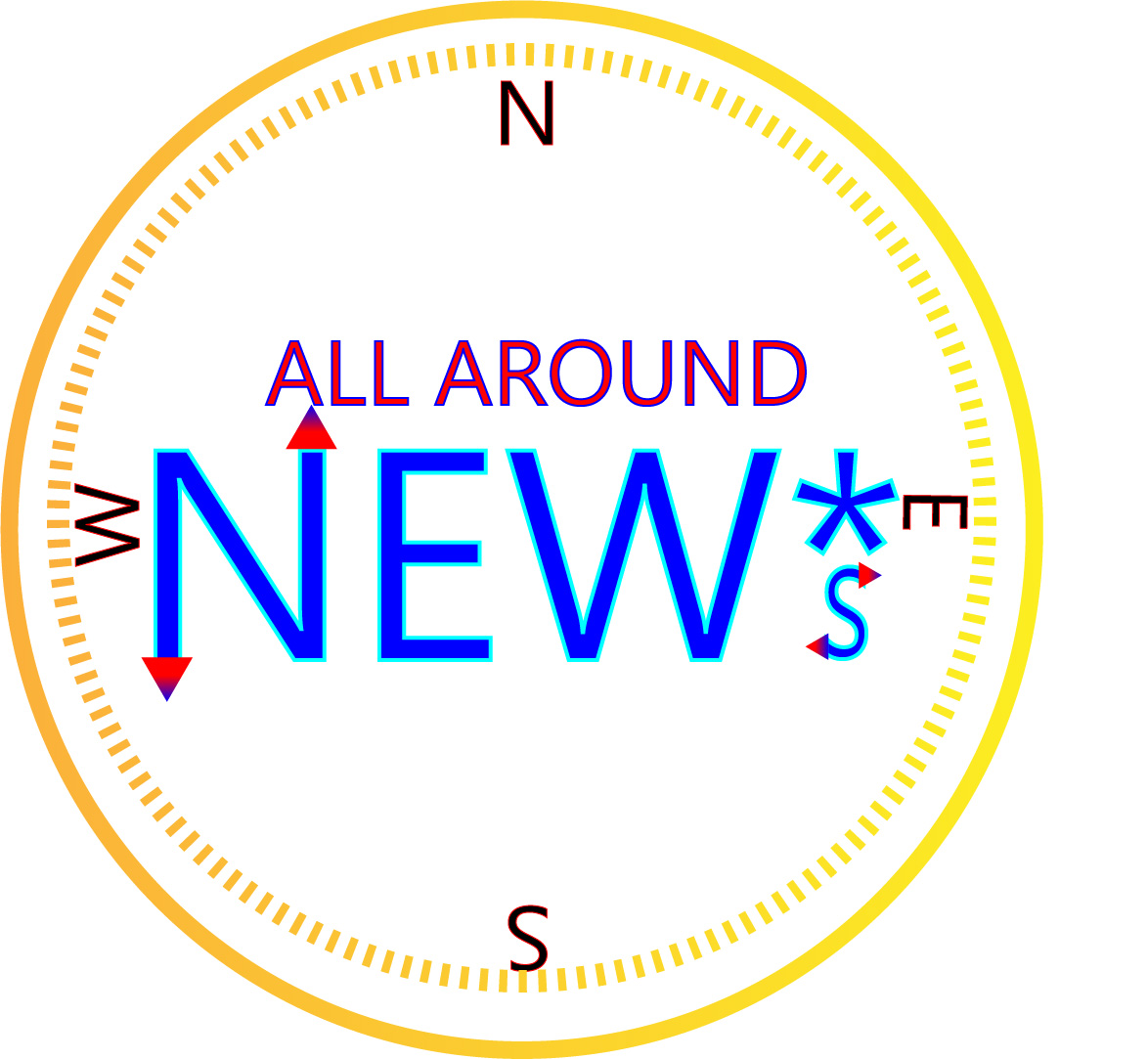
For this project I decided to create a logo that would represent my new media company called All Around NEW*s. The company aims to promote new media platforms through the internet such as podcasting, blogging, and streaming. I made a compass as a play on words of the “All Around” part of the title. The ‘*s’ is supposed to represent that this is a new media company and not just the classic form of news.
For my research I looked at other broadcasting companies such as CNN, FOX, and NBC. All of these companies have very simple logos with large text and little graphical design. This is because there logo is almost always displayed on a small scale on television so it has to be easily readable and identifiable. I tried to make my logo a very large text and the outline can be easily seen as a compass. The ‘all around’ text may be too small to see if scaled down but could ultimately be removed due to the compass outline anyway.
For my design process I started off with the NEW*s text and then found fill and stroke that I liked. I tried to use a gradient for the text but you can’t use gradient in a stroke. Then I made the ‘all around’ text and found a good fill and stroke. Then I made two concentric circles around the text and used a yellow to gold gradient, trying to emulate a gold compass. Then I put in the north, south, east, and west letters and rotated them as they would appear on a real compass. When it was all done I adjusted locations and scaling so that it looked appealing to the eye.
For all the elements in my logo I used only illustrator tools. Such tools included, ellipse tool, polygon tool, text tool, rotation tool, gradient, and made swatches to try and find the right colors. In the beginning I had some problems with grouping and making sure that the colors were coordinated and looked good. Overall though the process went fairly smooth.
